Christmas Color Trends 2026: 5 Colors and 4 Palettes (Chart)
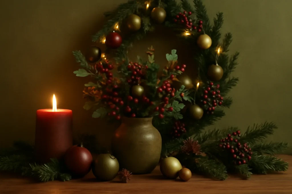
The Christmas colors of 2026 are olive green, matte gold, burgundy, terracotta and icy white, used with a matte finish rather than a glossy one. Pick two or three of them plus one metallic and you’re on trend without starting over.
If your storage bins are full of bright red and shiny gold, don’t panic. Almost nobody redecorates from zero, and you don’t need to: the chart below shows each color, where it does the most work and what it pairs with, so you can see in a minute which pieces you already own still fit.
The 5 Christmas Colors of 2026 at a Glance
| Color | Where to use it | Pairs best with | Finish |
|---|---|---|---|
| Olive or sage green | Base color: large ornaments, table runner | Wood, matte gold, white | Matte |
| Matte gold or copper | The link: ribbon, napkin rings, small accents | Every color on this list | Matte or soft sheen |
| Burgundy (velvet burgundy) | Accent: velvet bows, a few large ornaments | Matte gold, deep green, icy white | Velvety |
| Terracotta and warm beige | Natural looks: tablecloth, dried-fruit garlands | Jute, straw, olive green | Raw, natural |
| Icy white | Balance: candles, a few ornaments, tablecloth | Burgundy, sage, matte silver | Matte |
The biggest shift from previous years is the finish. Pure, bright red and mirror-shine gold are giving way to warmer, matte, cozier palettes that match where interior design is heading this year. Think less “shiny plastic” and more “elegant and cozy.” Below, each palette one by one, why texture matters as much as color, how to bring the look to your tree and your table, and the mistakes that most often throw a palette off.
Each 2026 Christmas Color and How to Use It
Olive green and sage green
Green steps away from the classic “pine” shade and shows up in softer, earthier versions. Olive and sage feel calm and mature, and they get along with almost everything: wood, matte gold, white and natural elements. It’s the most versatile choice of the year, and it works all year round, not just at Christmas, which helps if you want to reuse pieces later. Use olive green as your base color (large ornaments, a table runner) and save the sparkle for the details.
Matte gold and copper
Metallics are still here, but they’ve lost the mirror shine. Matte gold and copper look elegant and welcoming, without the cheap-ornament feel that very shiny gold can sometimes give off. They work as a common thread: the metallic is what ties together the other colors on the tree and the table and makes the whole look feel unified. If you can only invest in one new thing this year, swap your old shiny pieces for matte ones. The visual difference is big.
Burgundy and velvet burgundy
Red grows up. Instead of the usual bright red, deep, velvety burgundy steps in, a shade that calls to mind velvet and red wine. It’s sophisticated, pairs well with matte gold and dark green, and adds the touch of quiet luxury that shows up across 2026 decor references. To keep it from feeling heavy, balance burgundy with a light tone (icy white or beige) and choose matte textures over shiny satin.
Earth tones: terracotta and warm beige
Terracotta, clay, caramel and warm beige bring warmth and go hand in hand with the move toward more natural, personal homes. They’re great if you want to get away from the red-and-green cliché without losing the holiday mood. They look lovely with natural fibers (jute, straw), wood and dried foliage. It’s the ideal palette for a Christmas with a handmade feel.
Icy white for balance
Icy white gives the whole scheme room to breathe: it brightens, adds lightness and keeps dark palettes (burgundy, deep green) from looking heavy or gloomy. Use it in small doses, such as a few ornaments, candles or the tablecloth, as points of light that make the main colors stand out. In small rooms, white helps keep things from feeling crowded.
Texture: The Detail That Defines 2026
More than the colors themselves, what sets this year’s decorating apart is texture. The trend is matte, velvety and natural, as opposed to the smooth shine of previous years. In practice, that means choosing:
- matte ornaments instead of only mirrored ones;
- fabrics that look like velvet, linen and wool;
- natural elements: pinecones, branches, dried fruit, fibers;
- just a few points of shine, used on purpose to highlight.
Mixing finishes, like a matte ornament next to one with a soft sheen, creates depth without going overboard. That contrast in texture is what makes a display look thought through rather than bought as a boxed set.
4 Ready-Made 2026 Palettes: Two or Three Colors Plus One Metallic
The practical rule still applies: pick two to three main colors and use one metallic (matte gold or copper) to link them. Go beyond that and it turns into visual clutter. A few combinations that work especially well in 2026:
| Palette | Combination | Mood |
|---|---|---|
| Sophisticated | Burgundy + matte gold + icy white | Elegant and cozy |
| Natural | Olive green + terracotta + wood | Rustic and personal |
| Updated classic | Deep green + copper + cream | Traditional with polish |
| Serene | Sage + icy white + matte silver | Clean and modern |
A tip to help you decide: start from the color you already have the most of (in your dishes, your sofa, your walls) and build your Christmas palette from there. That way the decorations work with the room instead of fighting it.
How to Bring the Trend to Your Tree
To carry this year’s colors onto the tree, work in layers and from the inside out. Start with large matte ornaments in your main color close to the trunk to add volume and depth. Next, run ribbon in your metallic (matte gold or copper) down the tree in a cascade or in waves. Finally, place smaller ornaments and a few shiny accents at the branch tips, along with natural touches like pinecones and dried twigs tucked in here and there.
The secret is not to spread everything out evenly: group colors in small clusters and alternate them to create movement. If you’re starting from scratch with a large tree, our guide on how to make a Christmas tree look fuller helps you work out how many lights and ornaments you need for its height.
How to Bring the Trend to Your Holiday Table
The table is where your palette shows up most in photos, and it’s worth focusing your effort there. Use placemats or a runner in your main color, napkins in the year’s metallic and small natural details (greenery, pinecones, fruit, rosemary sprigs) to tie it all together. Matte candles set the mood at night. A low centerpiece with greenery and candles is more elegant and practical than tall arrangements that get in the way of conversation.
When you set the table from scratch, think in layers: a base in your main color, dishes that sit comfortably with the palette, then the metallic and natural details on top. Keep the arrangement low and spread along the center so everyone can see each other across the table.
The Natural, Sustainable Trend
More than a color story, 2026 brings a feeling: decorating with soul, sentimental pieces and natural materials. Real greenery, dried branches, pinecones, dried fruit slices, cinnamon sticks and fibers like jute are everywhere, and they have the advantage of being inexpensive, biodegradable and reusable. This approach works especially well with the olive green and earthy palettes, and it lets you decorate a whole room for next to nothing, using what you can gather in a park or your own backyard.
Reusing ornaments from past years is part of the same mindset: instead of buying everything new, refresh what you have with a few key pieces in this year’s colors. It’s easier on your wallet and more mindful.
Christmas in Summer: The Palette That Stays Fresh in the Heat
If your Christmas falls in summer, as it does in Australia and New Zealand, the heavier side of this palette can feel out of place at a long lunch in bright daylight. Lean on the lighter half instead: sage green, icy white and matte gold read cool and fresh, and a few terracotta touches pair naturally with outdoor tables, linen and greenery from the garden. Save velvet burgundy for small accents, like a ribbon on the wreath, rather than heavy fabrics.
How to Get the Look on a Budget
You don’t need to replace all your decorations. A few low-cost changes can update the whole look:
- swap only the ribbons and bows for the year’s metallic (matte gold or copper);
- add a few ornaments in an accent color (burgundy or olive green) to the decorations you already own;
- bring in free natural elements: branches, pinecones, greenery and dried fruit;
- focus your spending on the table, which shows up most in photos and is where you welcome your guests;
- go for matte candles, which are inexpensive and make a big visual impact at night.
For handmade touches in these colors, natural materials are your best friend: dried orange slices, cinnamon bundles tied with jute, painted pinecones and simple fabric bows in burgundy or olive all cost very little and fit any budget.
Common Mistakes When Choosing a Palette
- Using too many colors: more than three main shades breaks the harmony and makes the decor look confusing.
- All shine: skipping matte textures makes your decorations look dated.
- Forgetting balance: dark palettes without a light tone feel heavy.
- Ignoring the room: choosing colors that clash with the walls or the furniture.
- Buying everything new: it wastes money and goes against this year’s sustainable spirit.
What to Prioritize if You’re Adding Pieces
If you’re filling in your decorations, prioritize the items that carry the palette the most: ornaments and ribbon in the trending shades, with a matte finish.
- A set of ornaments in the trend colors: the base of your palette, in olive green or burgundy.
- Wired Christmas ribbon (matte gold or plaid): it adds volume and ties the colors together.
- Matte gold or copper accents: the metallic that pulls the whole look together.
Whatever colors end up on your tree, the best palette is the one that makes you smile when you switch the lights on at night. May your house look like you this Christmas.
Frequently Asked Questions
What is the Christmas color for 2026?
There isn’t a single color: the trend is a palette. Olive green is the strongest base color of the year, joined by matte gold, burgundy (velvet burgundy), terracotta and icy white, always with a matte finish.
What color should a Christmas tree be in 2026?
Use olive green or another main color from the palette for large matte ornaments, matte gold or copper ribbon, and natural elements like pinecones. For a lighter tree, pair icy white with matte gold.
What are the trending Christmas colors for 2026?
Olive and sage green, matte gold and copper, burgundy (velvet burgundy), earth tones like terracotta, and icy white for balance, all with a more matte, natural finish.
What is the velvet burgundy palette?
It’s using a deep, velvety burgundy in place of bright red. It feels sophisticated and pairs with matte gold and dark green, balanced by a light tone.
Do earth tones work for Christmas?
Yes. Terracotta, clay and warm beige bring warmth and fit the natural, personal decorating trend of 2026, pairing well with wood and natural fibers.
How can I follow the trend on a budget?
Swap only your ribbons and a few ornaments for the year’s colors, add free natural elements, reuse what you already have and focus your spending on the holiday table.